Imagine walking into a room that feels like a warm hug—inviting yet sophisticated. That’s the magic of a neutral color palette. It’s like the Swiss Army knife of interior design, effortlessly blending with any style while making spaces feel larger and brighter. Who wouldn’t want a home that feels like a serene escape from the chaos of daily life?
Using neutral colors isn’t just a trend; it’s a timeless strategy that adds elegance without overwhelming the senses. Think of it as the reliable friend who always knows how to keep things classy. Whether it’s soft beiges, gentle greys, or creamy whites, these shades create a perfect backdrop for your personality to shine through. So, if you’re ready to elevate your space and impress your guests, it’s time to embrace the understated charm of a neutral color palette.
Table of Contents
ToggleUnderstanding Neutral Color Palette Use
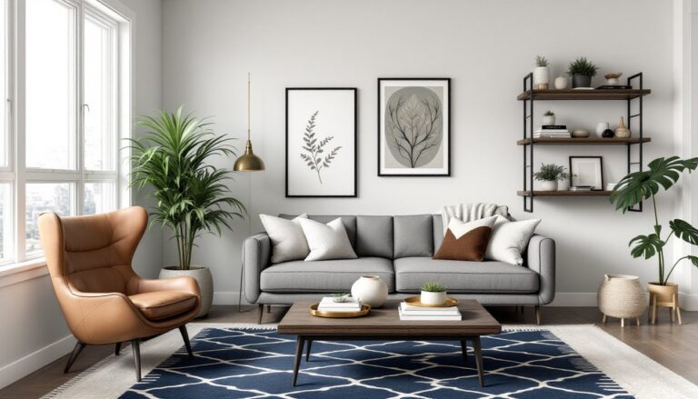
Neutral colors play a vital role in interior design, providing a versatile backdrop that enhances decor while promoting a calm atmosphere. Their understated elegance creates spaces that feel inviting and expansive.
Definition of Neutral Colors
Neutral colors are tones that lack vibrant hues, typically including shades like white, gray, beige, and taupe. These colors serve as a canvas, making it easier to incorporate other design elements. They often harmonize with various furnishings and textures, promoting a cohesive look. By not dominating the space, neutral colors enable a range of aesthetics from traditional to modern. Their adaptability makes them a popular choice among designers looking for elegance without the distraction of bold colors.
Types of Neutral Colors
Neutral colors can be broadly categorized into four primary types: warm, cool, muted, and bright. Warm neutrals, such as beige and tan, evoke coziness while inviting warmth into a room. Cool neutrals, including blue-gray and soft taupe, provide a calming effect. Muted neutrals such as soft whites carry understated sophistication, while bright neutrals like off-white and light gray reflect more light and enhance spaciousness. Each type can serve different purposes in design, catering to specific moods or styles within a space.
Benefits of Neutral Color Palette Use
Neutral color palettes offer various benefits in interior design. These colors enhance versatility and create a serene atmosphere that enhances any space.
Versatility in Design
Neutral colors adapt to numerous styles, making them ideal for various design approaches. They easily blend with vibrant accent colors or bold decor elements. Transitioning from classic to modern designs becomes seamless with neutral shades. Many homeowners opt for beige, gray, or white walls to maintain flexibility in decor choices. This allows for effortless changes in furniture and accessories without the need for a complete overhaul. Spaces appear cohesive and polished, enhancing overall aesthetics.
Creating a Calm Environment
Calmness thrives in rooms decorated with neutral colors. Soft beiges and delicate greys instill a sense of tranquility, which promotes relaxation. Using these colors in bedrooms or living areas contributes to a peaceful atmosphere that encourages rest. Bright colors can overwhelm, while neutrals maintain a soothing ambiance. They also cultivate a serene backdrop, allowing personal styles and textures to shine. Careful consideration of light in these spaces enhances the calming effect, further promoting well-being.
Application of Neutral Color Palette Use
Neutral color palettes find extensive application in various fields, including interior design and fashion. Their versatility enhances aesthetics while promoting balance and coherence.
Interior Design
Neutral colors lend sophistication to interior spaces. Soft beiges, gentle grays, and creamy whites create serene backdrops that amplify natural light. Walls painted in these hues provide flexibility, allowing easier integration of vibrant accents. Decor elements such as textiles and artwork flourish against neutral shades. Additionally, muted tones foster a tranquil atmosphere ideal for relaxation. Textured accessories like cushions and throws further enrich the overall space. Room size feels more expansive with these calming palettes, appealing to homeowners who prioritize an inviting environment. Overall, neutral colors establish a timeless elegance that transcends trends and personal styles.
Fashion and Style
In fashion, neutral color palettes serve as timeless staples. Shades like taupe, ivory, and soft gray offer versatility in outfit combinations. Chic ensembles emerge when blending neutral tones with statement accessories. Layering becomes seamless as these colors pair well across various pieces. Designers utilize neutrals to create a refined, minimalist look that resonates with many. Classic items such as tailored coats or trousers in neutral shades form the foundation of versatile wardrobes. These colors enhance individuality, allowing personal statements to stand out without overwhelming the overall look. Ultimately, a neutral palette contributes to sophisticated, stylish attire that remains relevant season after season.
Challenges of Neutral Color Palette Use
Neutral color palettes present unique challenges, despite their elegance and versatility.
Potential for Boredom
Boredom often arises from extensive use of neutral colors. A space filled with varying shades of beige or gray can lack visual intrigue. Additionally, monotony can make even well-designed areas feel uninspired. Designers must strategically mix textures and materials to counteract this effect. Incorporating subtle patterns or layered elements can create depth and interest. Choosing accent pieces in vibrant colors can also break the neutrality, adding vitality to the overall design.
Overcoming Color Limitations
Color limitations present a hurdle when working solely with neutrals. An over-reliance on these shades can restrict creative expression. Though neutrals serve versatile purposes, they may not convey the desired emotions in certain settings. Designers can overcome this by integrating bold accent colors or statement art pieces. Using a mix of warm and cool neutrals adds dimension and character. Exploring various finishes and materials can also introduce unique visual elements, enhancing the overall aesthetic without overwhelming the space.
Embracing a neutral color palette can transform any space into a haven of elegance and tranquility. By choosing shades like soft beiges and gentle grays, one can create a versatile backdrop that enhances personal style while promoting a calm atmosphere. The strategic use of textures and accent colors ensures that even the most neutral environments remain visually engaging.
Whether in interior design or fashion, neutral tones offer timeless appeal and adaptability. They allow for easy updates and seamless integration with bolder elements, making them a smart choice for anyone looking to elevate their aesthetic. Ultimately, a well-executed neutral palette balances sophistication with warmth, making it a go-to option for creating inviting and stylish spaces.