When you walk into a room that feels “right,” you’re experiencing design harmony. It’s not necessarily expensive furniture or trendy colors, it’s the way elements work together to create a sense of calm and intentionality. Harmony in interior design is the art of balancing different components so they support one another rather than compete. For homeowners and DIY enthusiasts looking to refresh their spaces, understanding harmony transforms projects from scattered attempts into cohesive, inviting rooms. Whether you’re redesigning your living room or planning a full home refresh, this practical guide will help you grasp the fundamentals and apply them immediately.
Table of Contents
ToggleKey Takeaways
- Harmony in interior design is achieved when all design elements—color, texture, furniture scale, lighting, and materials—work together cohesively to create calm and intentionality rather than visual chaos.
- Apply the 60-30-10 color rule with one dominant color, secondary supporting color, and accent colors to establish visual and tonal consistency without monotony.
- Balance furniture scale and proportion by measuring your room, anchoring large pieces with complementary elements, and arranging accessories in intentional odd numbers to create visual weight distribution.
- Intentionally repeat design elements across at least three non-adjacent areas—such as secondary colors, materials, and textiles—to create true harmony and cohesion throughout your space.
- Avoid common mistakes like multiple focal points, orphaned furniture, jarring style transitions, and random metal mixing that undermine design harmony and make rooms feel disjointed.
- Use negative space and restraint strategically; empty surfaces and uncluttered walls are essential to harmony and help rooms feel calm and intentional rather than visually overwhelming.
What Is Harmony in Interior Design?
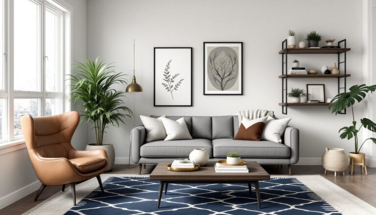
Harmony in interior design refers to the visual and functional balance achieved when all design elements, color, texture, furniture scale, lighting, and materials, work together cohesively. Think of it like a well-tuned orchestra: each instrument sounds distinct, but together they create something greater than any single note.
At its core, harmony prevents a room from feeling chaotic or disjointed. It’s the difference between a space that looks thrown together and one that feels intentional. You achieve harmony by repeating design elements thoughtfully, maintaining visual weight distribution, and ensuring that every piece serves the room’s overall aesthetic and function.
Harmony doesn’t mean everything matches or looks identical. In fact, successful harmonious rooms often feature varied textures, multiple colors, and different furniture styles. The key is repetition with purpose and balance. When you walk into a harmonious space, whether it’s a cozy cottage or a modern loft, your eye naturally rests and moves through the room without jarring surprises. Recent design philosophy shows that rooms with strong harmonic principles feel larger, more relaxing, and more functional, even if they contain fewer pieces than chaotic alternatives.
The Core Principles of Design Harmony
Several foundational principles underpin harmonious design. Understanding these principles gives you a mental framework for every decorating decision.
Color and Tone Consistency
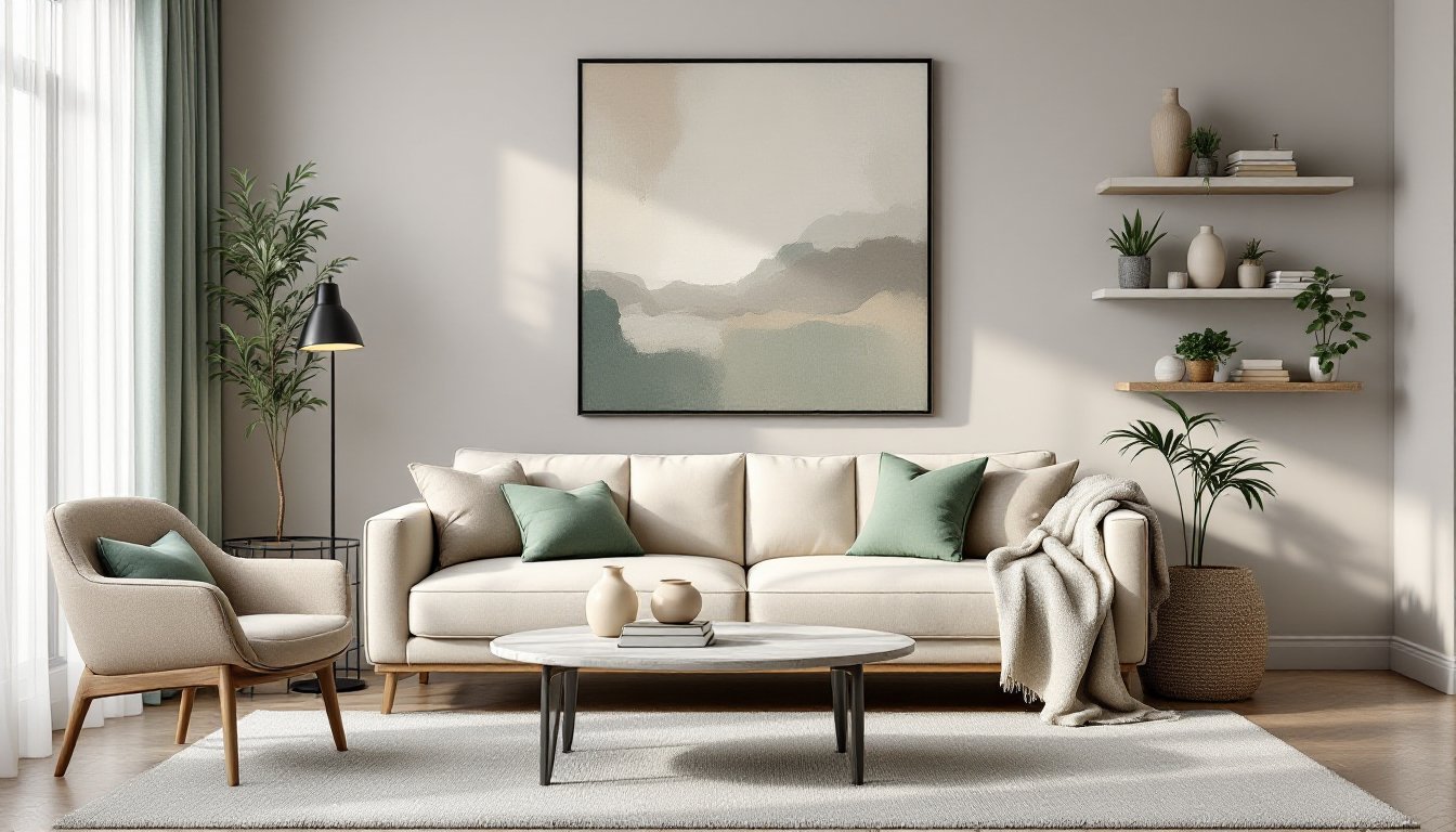
Color harmony starts with selecting a cohesive palette. This doesn’t mean using only one color: instead, you choose a primary hue, support it with complementary or analogous colors, and tie everything together with neutral tones. Many successful rooms rely on a 60-30-10 rule: 60% dominant color, 30% secondary color, and 10% accent color.
Tone, the lightness or darkness of a color, matters as much as the color itself. A room filled with light pastels reads entirely differently from one using deep jewel tones, even if the hues are similar. When tones clash (pairing very pale colors with very dark ones without transition), spaces feel visually unstable. Consistency doesn’t require monotony: it means creating a logical progression. Tools like modern home interior design resources show how contemporary spaces use unexpected color combinations while maintaining tonal harmony through careful placement and balance.
Texture also plays a critical role in color harmony. A matte finish reads differently than a glossy one, and layering varied textures, such as linen, wood, metal, and glass, creates visual interest while maintaining coherence.
Scale, Proportion, and Balance
Scale refers to the size of objects relative to the room and each other. A tiny side table next to an oversized sectional sofa creates visual imbalance. Proportion is how well an object’s dimensions relate to its function and surroundings. A standard dining table’s height works at 30 inches because that proportion feels comfortable: drastically different heights feel awkward.
Balance comes in two forms: symmetrical balance (identical or near-identical arrangement on both sides) and asymmetrical balance (different objects of similar visual weight arranged unevenly). Most modern spaces favor asymmetrical balance, which feels more dynamic and livable. But, both approaches require harmony, elements can’t feel haphazardly placed.
When furnishing a room, consider sight lines and how objects relate spatially. A tall bookcase needs visual anchoring (perhaps a large artwork or console table) to prevent it from dominating. Small accessories scattered randomly create visual chaos: grouped in odd numbers (three or five items), they feel intentional. Designers working on dining room interior design projects often emphasize that a well-proportioned dining table anchors the entire space, making supporting furniture and decor fall into place naturally.
How to Achieve Harmony in Your Home
Achieving harmony is a practical, step-by-step process. Start by identifying your room’s purpose and constraints, a home office needs different harmony than a bedroom, and a small apartment requires different spatial strategies than a sprawling house.
Step 1: Establish your color palette. Choose a dominant color (often neutral: white, beige, gray, or soft taupe), a secondary color that complements it, and 1–2 accent colors. Pull inspiration from existing elements you love, perhaps a piece of art, a rug, or a beloved furniture piece. Write down the specific colors and their approximate percentages. Sites like House Beautiful regularly showcase room palettes broken down by percentage, which provides a useful reference.
Step 2: Assess your furniture’s scale and proportion. Measure your room and sketch a floor plan. Note the height and visual weight of existing pieces. If your sofa dominates the space, balance it with a substantial bookcase, console, or media unit. Avoid clustering small, delicate furniture in a large room or overwhelming a compact space with oversized pieces.
Step 3: Repeat design elements intentionally. This is where harmony truly emerges. Repeat your secondary color in at least three non-adjacent areas, a pillow here, wall art there, a decorative object elsewhere. Repeat materials: if you choose warm wood tones, carry that material through flooring, furniture, and accessories. Textiles (curtains, rugs, throws) unify spaces because fabric naturally ties colors and textures together.
Step 4: Add layers, not clutter. Harmony thrives with layers of interest, layered lighting (overhead, task, ambient), multiple textures (smooth marble, nubby wool, polished metal), and varied heights. The home office interior design approach emphasizes functional layering: workspace furniture, task lighting, storage, and personal touches all coexist without overwhelming the room.
Step 5: Use neutrals to bridge gaps. White, gray, beige, and natural wood don’t compete: they let other colors shine while creating visual rest. If your accent colors feel disconnected, introducing neutral-toned furniture or larger wall areas often solves the problem. A neutral sofa, for instance, can bridge bold accent colors that might clash if placed directly adjacent.
Step 6: Trust negative space. Empty wall space and uncluttered surfaces aren’t failures, they’re essential to harmony. Rooms that feel calm have breathing room. Every surface doesn’t need decoration. Every wall doesn’t need color variation. Restraint is a design choice that enhances harmony.
Common Harmony Design Mistakes to Avoid
Understanding what breaks harmony helps you recognize and prevent problems.
Too many focal points. A focal point is an intentional center of visual attention, a fireplace, large artwork, or accent wall. When a room has three equally weighted focal points, the eye doesn’t know where to rest, and the space feels chaotic. Choose one primary focal point and support it with secondary elements. Your focal point sets the room’s tone and often informs your color palette and style decisions.
Orphaned furniture. Placing a large piece (an entertainment center, cabinet, or bookcase) without visual anchors makes it feel disconnected. Large pieces need supporting elements, art above, accessories on adjacent surfaces, or color repetition elsewhere in the room, to feel integrated.
Ignoring transitions. Jarring shifts between design styles or colors create discord. If you’re mixing mid-century modern furniture with traditional pieces, transitions matter: perhaps a neutral rug bridges them, or similar wood tones create continuity. Without intentional transitions, eclectic style reads as accidental mismatching. Resources like Elle Decor showcase designer approaches to blending styles through careful color and material choices.
Forgetting the vertical dimension. Harmony includes vertical balance. If all furniture sits low (floor-level seating, low-profile storage), the room feels squat and unfinished. Tall elements (floor lamps, bookcases, mirrors, wall-mounted shelving) carry the eye upward and enliven compact spaces.
Mixing metals without intention. Gold, silver, bronze, and copper don’t naturally harmonize when scattered randomly. Choose one primary metal tone and use one secondary tone as accent. A gold-framed mirror with silver wall sconces, for instance, needs a cohesive reason, perhaps the room’s color palette calls for cool tones with warm accents. Thoughtful metal selection supports harmony: random mixing undermines it.
Over-accessorizing. Cramming every shelf with objects and covering every surface with decor creates visual noise. In harmonious rooms, accessories are curated. Each item earns its place through color coordination, thematic connection, or functional purpose. Freshome regularly features thoughtfully curated spaces where fewer, well-chosen accessories create more impact than crowded displays.
Conclusion
Harmony in interior design isn’t an expensive, unattainable goal, it’s a practical framework for intentional decorating. By understanding color relationships, scale and proportion, and the power of repetition, you can transform any room into a cohesive, inviting space. Start with one room, apply these principles, and observe how the space feels more restful and purposeful. As you gain confidence, you’ll recognize harmony instinctively, making future projects smoother and more satisfying.