Color isn’t just decoration, it’s architecture for your emotions. When you step into a room painted soft blue, your heart rate actually slows. Walk into a space dominated by warm oranges and reds, and energy rises. This is color psychology in interior design, and it’s far more than aesthetic preference. As homeowners plan renovations and refresh living spaces, understanding how color influences mood and behavior can turn a basic room into a purposeful sanctuary. This guide walks you through the science behind color choices and shows you exactly how to apply it room by room, so your home doesn’t just look good, it feels intentional.
Table of Contents
ToggleKey Takeaways
- Color psychology in interior design is a strategic tool that influences mood and behavior by triggering emotional and physical responses through specific hues.
- Cool colors like blue and green activate the parasympathetic nervous system to promote calm and relaxation, making them ideal for bedrooms and focused work spaces.
- Warm colors such as red, orange, and yellow stimulate energy and appetite by activating the sympathetic nervous system, working best in kitchens, dining areas, and creative spaces.
- Always test paint colors with sample swatches on different walls and observe them at multiple times of day, as natural and artificial light significantly alter how colors appear.
- Match color selection to each room’s function and your personal preferences—cool tones for relaxation, warm tones for social gathering—rather than following design trends.
- Use accent walls or lower portions of rooms for bold colors to gain psychological benefits without overwhelming the space, ensuring intentional transitions between adjacent rooms.
Understanding Color Psychology and Its Role in Home Design
Color psychology is the study of how hues affect human behavior, perception, and emotion. It’s rooted in both biology and cultural conditioning. Your eyes don’t just register color, they send signals to your brain that trigger physical and emotional responses. A red wall can make a room feel smaller and more intimate, while a pale yellow expands the sense of space and warmth.
In home design, color psychology isn’t about following trends. It’s about crafting environments that support how you actually live. When you’re choosing paint for your kitchen, you’re not just picking a shade you like: you’re selecting a tool that will influence your family’s mood every morning at breakfast. This is why professional designers and homeowners who understand color’s impact make more intentional, lasting choices. Your space becomes a reflection of function and feeling combined, not just aesthetics alone.
The good news? You don’t need a design degree to apply these principles. A few core concepts, understanding warm versus cool tones, knowing which colors energize and which calm, give you everything you need to make informed decisions. When working with a Modern Home Interior Design approach, color becomes a strategic tool rather than a decorative afterthought.
How Different Colors Affect Mood and Behavior
Every color sits on a spectrum, and where it lands determines its psychological effect. Think of colors as falling into two camps: cool and warm. Understanding this division is the foundation of intentional color selection.
The Emotional Impact of Cool Colors
Cool colors, blues, greens, and purples, activate the parasympathetic nervous system. They slow your breathing, lower blood pressure, and create a sense of calm. Blue is the most universally calming color: studies show it’s associated with trust, stability, and peace. That’s why bedrooms and bathrooms often benefit from cool palettes.
Green sits between cool and neutral, carrying associations with nature, renewal, and balance. It’s forgiving in most rooms because it doesn’t overstimulate. Purple, especially softer lavenders, promotes introspection and creativity. But, deep purples can feel heavy if used as a dominant wall color in small spaces.
Cool colors also create perceived distance. A room painted pale blue feels larger and more open than the same room in warm tones. This makes cool shades practical for cramped spaces. Use cool colors when you want to encourage relaxation, focus, or a sense of spaciousness.
The Energizing Effect of Warm Colors
Warm colors, reds, oranges, and yellows, stimulate the sympathetic nervous system. They increase heart rate, appetite, and social energy. Red is the most intense: it demands attention and creates urgency. A red accent wall works well in dining rooms or home gyms, but as a dominant color in a bedroom, it can disrupt sleep.
Orange brings warmth and playfulness without red’s intensity. It works beautifully in kitchens, home offices, and creative spaces. Yellow, especially pale or buttery shades, boosts mood and mental clarity. But, bright, acidic yellows can cause eye strain and overstimulation in large doses.
Warm colors also make spaces feel cozier and more intimate. A room painted warm cream or soft coral feels more enclosed and social than the same room in cool tones. Understanding these effects helps you match color to room purpose and your household’s actual needs.
Practical Applications for Each Room in Your Home
The best color for your walls depends entirely on what happens in that room and who uses it. Here’s how to apply color psychology strategically.
Bedrooms demand cool, muted tones. Soft blues, pale greens, and warm grays promote sleep and relaxation. Avoid bright whites and anything overstimulating. If you prefer warmth, choose dusty rose or warm beige rather than vibrant coral.
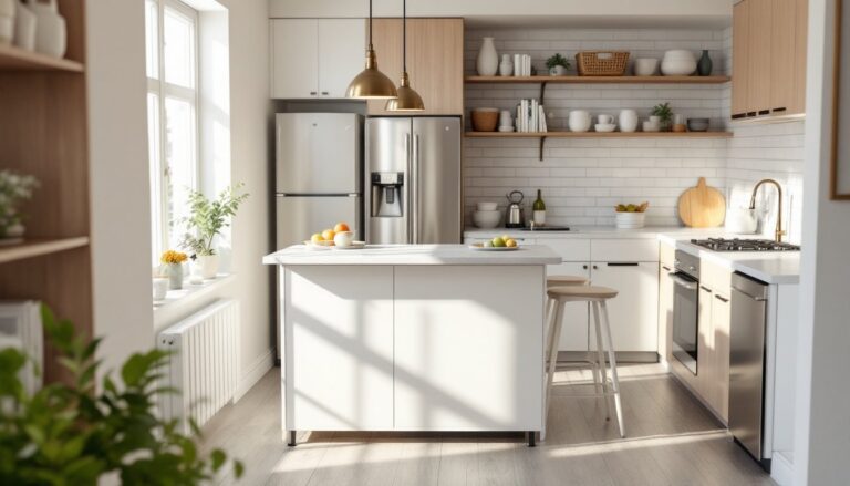
Kitchens benefit from warm, energizing colors that stimulate appetite and conversation. Warm whites, pale oranges, soft reds, and earthy yellows create an inviting gathering space. Many people default to white or cream, which is safe, but adding warmth, perhaps through Dining Room Interior Design accent walls or lower cabinets, makes the space more dynamic.
Bathrooms work well in cool or neutral tones. Soft blues and greens create a spa-like feeling. Light colors also make small bathrooms feel larger. If your bathroom is windowless, a warmer neutral like soft taupe prevents it from feeling clinical.
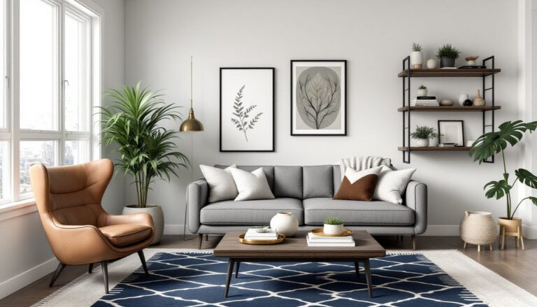
Living rooms and family spaces should balance energy and comfort. Living Room Home Interior design often succeeds with warm neutrals as the base and cool accents for visual interest. Consider your room’s light (north-facing rooms feel colder: south-facing rooms feel warmer naturally) and adjust accordingly.
Home offices need focus without fatigue. Soft blues and pale greens support concentration, while muted warm tones prevent the space from feeling sterile. Avoid reds and bright oranges, which create restlessness during long work sessions.
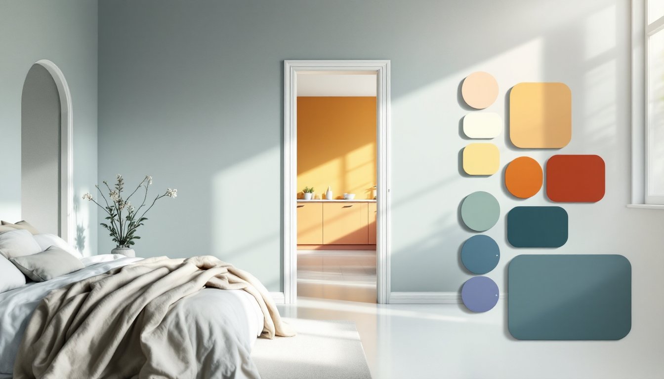
When selecting a specific paint color, always get sample pots and paint large swatches on different walls. Observe them at different times of day, morning light, afternoon light, and evening artificial light all shift how colors read. This is non-negotiable prep work that prevents expensive repaints.
Choosing Colors Based on Your Design Goals and Personal Preferences
Color psychology provides a framework, but your personal connection to color matters too. Some people gravitate toward bold, energizing spaces: others thrive in calm, muted environments. The goal is understanding the science while honoring what actually makes you feel at home.
Start by asking: What do I want to feel in this room? If you want energy and social gathering, lean toward warm palettes. If you want focus and relaxation, cool tones serve you better. Then consider your home’s existing light and architecture. Designers working with Modern Art Deco styles often pair jewel tones with metallic accents, while Neutral Color Palette approaches rely on depth through texture and subtle warm-cool shifts.
Also think about flow between rooms. Your spaces don’t need to match, but they should feel intentional together. A cool blue bedroom leading into a warm cream kitchen creates distinct moods that support different activities. Jarring transitions feel chaotic.
If bold color appeals to you, consider it on an accent wall or lower portion of a room rather than all four walls. This gives you the psychological benefit of color without overwhelming the space. Recent research from House Beautiful examining zen interior color psychology confirms that balanced, intentional color use beats saturated walls in supporting long-term well-being.
Safety note: Always use quality interior paint with proper ventilation during application and drying. Wear a dust mask if sanding primer or old paint, and ensure good air circulation. This protects your respiratory system and helps paint cure properly.
Conclusion
Color psychology transforms interior design from guesswork into strategy. By matching hues to room function and your household’s actual needs, you create spaces that support how you live, not just how they photograph. Start with one room, apply these principles, and notice how the color shift changes how you feel in that space. You’re not just painting walls, you’re designing for well-being.