Interior graphic design is more than just picking colors and fonts for your walls. It’s a deliberate, strategic approach to shaping how your home feels, flows, and communicates your personal style. When you understand the principles behind visual composition, typography, and color psychology, you can transform any room from bland to intentional, without hiring an expensive designer. Whether you’re redecorating a single accent wall or overhauling your entire space, these design principles give you the framework to make choices that work, not just look nice for a week before you tire of them.
Table of Contents
ToggleKey Takeaways
- Interior graphic design applies visual communication principles to transform your home by strategically using color, typography, and composition to guide how spaces feel and function.
- Color psychology directly impacts mood—warm colors energize and advance visually while cool colors promote calm and recede, so match your palette to each room’s intended purpose.
- The 60-30-10 color rule (primary 60%, secondary 30%, accent 10%) creates visual harmony, and limiting typography to 2-3 typefaces prevents overwhelming your space.
- Visual balance through asymmetrical composition and the rule of thirds creates more dynamic, modern interiors than rigid symmetry, while negative space prevents rooms from feeling cluttered.
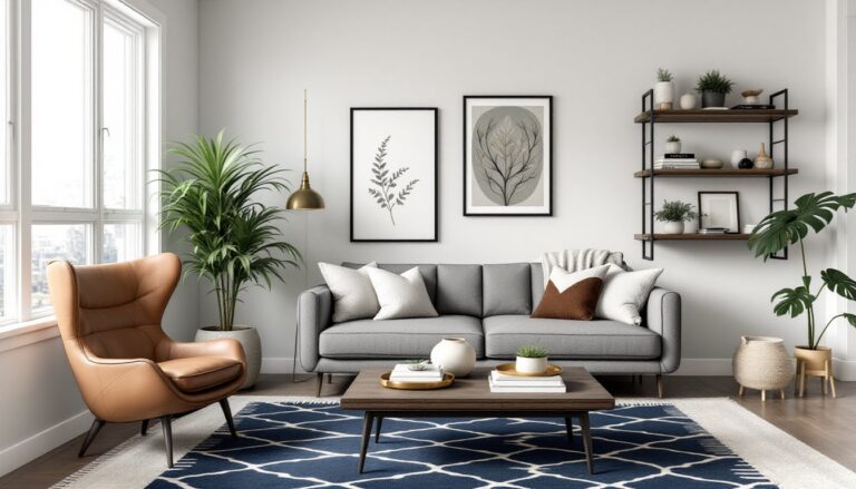
- Every room needs a strong focal point—an accent wall, gallery wall, or statement piece—that anchors the visual hierarchy and guides the eye naturally through the space.
- DIY projects like accent walls, gallery walls, and custom typography signs prove that applying interior graphic design principles requires no professional degree, just intentional planning and quality execution.
What Is Interior Graphic Design and Why It Matters for Your Home
Interior graphic design applies visual communication principles, typography, color, pattern, and composition, directly to residential spaces. It’s the intersection of graphic design and interior decorating, where every wall, piece of furniture, and decorative accent serves a visual purpose beyond mere decoration.
Why does this matter? Because your home tells a story. When graphic design principles are applied intentionally, they guide the eye, establish mood, and create cohesion across rooms. Without them, spaces feel scattered. Think of walking into a room where the colors clash, text elements are random, and nothing feels related. Now compare that to a room where a consistent color palette, thoughtful typography on artwork or signs, and balanced visual weight make you feel calm and oriented.
For DIY homeowners, understanding these principles means you can make smarter decisions about paint colors, artwork placement, accent walls, and decorative elements. You won’t need a degree in design, just a framework for why certain choices work.
Color Theory and Psychology in Residential Spaces
Color is the fastest way to change how a room feels. Before you pick up a paintbrush, understand what colors actually do to mood and perception.
Warm colors, reds, oranges, yellows, energize and advance visually. They make walls feel closer, which works well for larger, cooler rooms but can feel cramped in small spaces. Cool colors, blues, greens, purples, recede visually and promote calm, making smaller rooms feel more open. Neutrals, grays, beiges, whites, serve as anchors and let other elements shine.
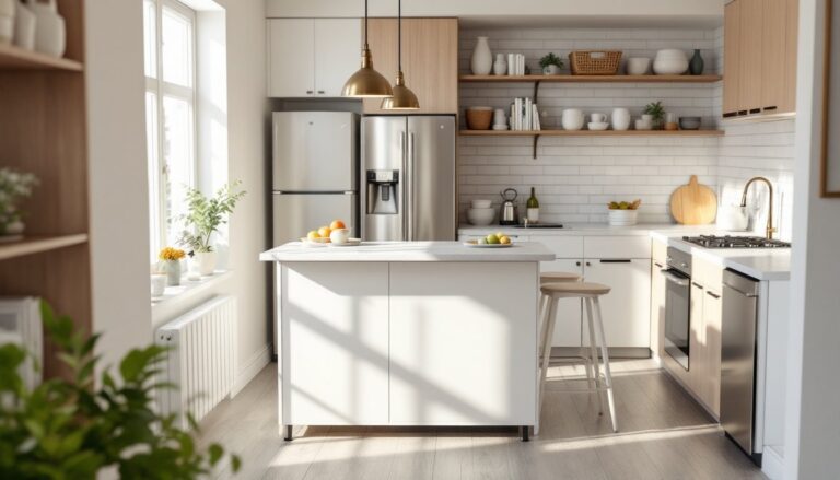
The psychology matters too. Studies show that blues and greens reduce stress, which is why they’re popular in bedrooms and bathrooms. Warm tones encourage appetite and conversation, making them ideal for kitchens and dining areas. Reds and oranges can feel stimulating in large doses but work beautifully as accent colors.
Here’s a practical approach: Start with your largest surface (walls). Choose a neutral or soft version of your preferred color. Then layer in accent colors through furniture, artwork, and textiles. This gives you flexibility, you can swap out accessories without repainting. Research shows living room designs benefit from a primary color taking up about 60% of the space, a secondary color at 30%, and accent colors filling the remaining 10%. This ratio creates visual harmony without boredom.
Typography and Text Elements in Home Décor
Typography isn’t just for graphic designers, it belongs in your home. Whether it’s wall decals, framed quotes, custom signs, or even the fonts on your throw pillow covers, typography shapes the personality of a room.
Choose typefaces that match your home’s vibe. Serif fonts (with little feet or lines) feel traditional and formal, think gallery placards or vintage libraries. Sans-serif fonts (clean, no serifs) feel modern and approachable. Script and decorative fonts add personality but can overwhelm if overused.
When adding text to your space, keep these rules simple: Limit yourself to two or three typefaces maximum. One should be your dominant font for larger text or wall art, one for secondary text, and optionally a decorative one for small accents. Mix sizes and weights, bold headings paired with lighter body text create visual rhythm. Ensure readability: dark text on light backgrounds or vice versa. Masculine interior design often employs bold, clean typography on gallery walls, which reinforces the aesthetic without feel over-decorated.
Practical project: Create a custom wood sign using stencils and paint, or frame typography-focused art prints from your preferred designer. This adds personality at minimal cost and lets you control the message and visual weight.
Visual Balance and Composition Techniques
Visual balance doesn’t mean symmetry, it means the weight of elements feels even across your space. Symmetrical balance (mirrored on both sides) feels formal and static. Asymmetrical balance (unequal but visually balanced placement) feels dynamic and modern.
Think of visual weight as the “pull” a design element has on the eye. Large, dark, or bold items carry more visual weight than small, light, or subtle ones. In an asymmetrical layout, you might balance a large piece of dark artwork on one side with a small cluster of lighter items on the other.
Composition is about how elements relate to each other spatially. The rule of thirds (dividing space into nine equal sections and placing focal points along the lines) creates natural visual interest. Negative space (empty space) is equally important, it gives the eye a place to rest and prevents the room from feeling chaotic.
Here’s where DIYers often stumble: cramming every available surface with decor. Negative space is working for you, not against you. A sparsely decorated wall with one large piece of art often feels more impactful than five small pieces competing for attention.
Creating Focal Points With Graphic Design
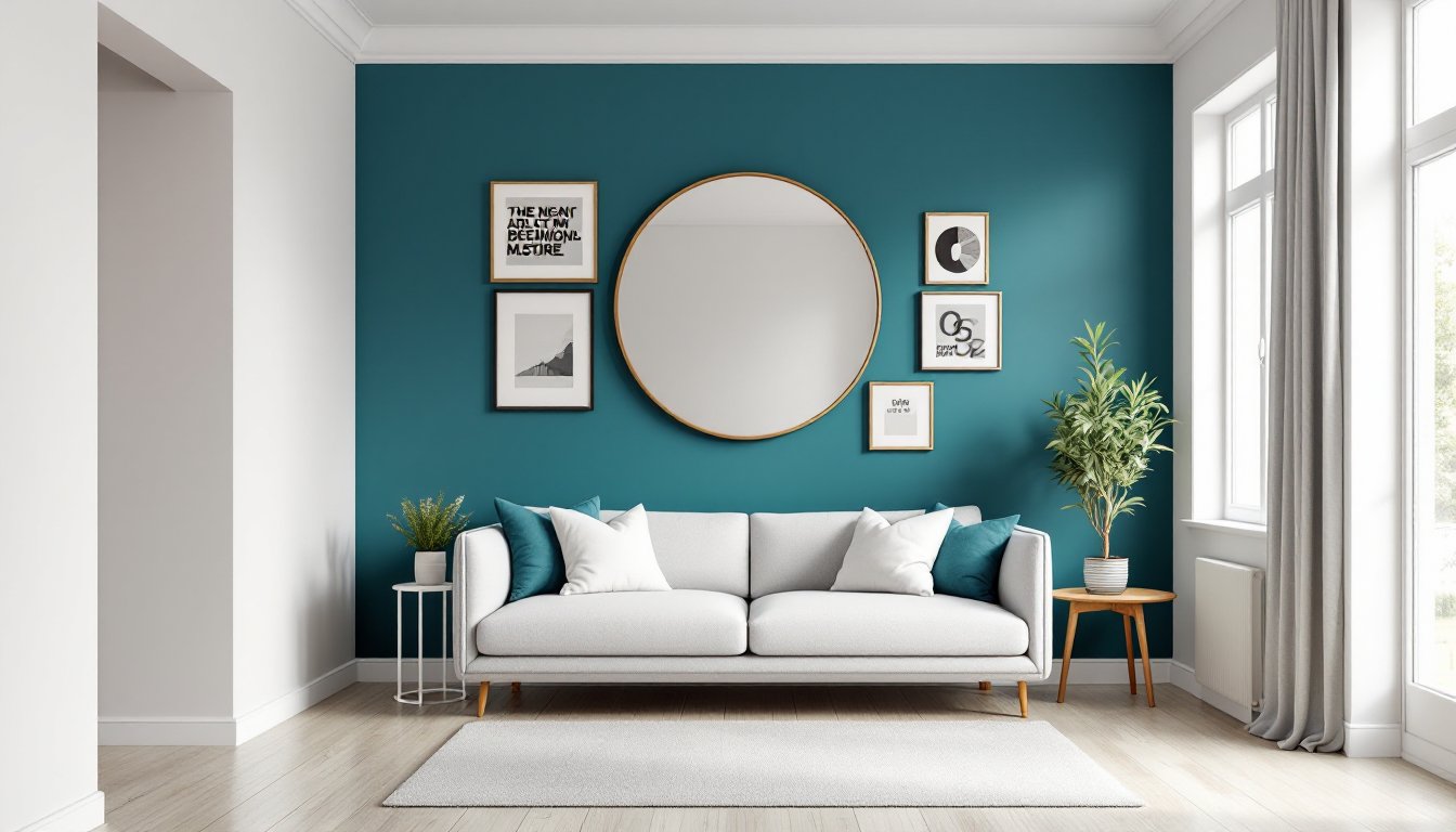
Every room needs a focal point, the place your eye naturally lands first. It might be a fireplace, window, accent wall, or gallery wall. Once identified, let it dominate the visual hierarchy.
To create a graphic focal point, use contrast. A bold accent wall behind a seating area, a gallery wall with mixed frames and art, or a large statement-making piece of typography all work. The key is establishing a clear visual anchor, then supporting it with secondary elements that don’t compete. Sites like Decoist showcase how modern homes establish focal points through strategic color, art placement, and negative space. Notice how the eye naturally moves to one primary area, then discovers secondary details, that’s deliberate design.
Practical approach: Paint an accent wall (usually the wall opposite the entrance to a room), hang a statement mirror or art piece, or create a feature wall with peel-and-stick wallpaper or geometric decals. Make it bold enough that it becomes the first thing you notice when entering, but keep surrounding elements subtle.
Practical DIY Projects Using Interior Graphic Design Principles
Now that you understand the theory, here are actionable projects that apply these principles:
Accent Wall Project: Choose one wall in a room and paint it a bold color from your chosen palette. Use a quality interior latex paint (aim for one with at least 35% pigment for better coverage) and prep the wall properly, clean, prime if needed, and use painter’s tape for clean edges. This single change shifts the entire room’s personality.
Gallery Wall: Arrange framed art, typography prints, and photos using the rule of thirds. Start by laying pieces on the floor and photographing the arrangement. Transfer to the wall using a level and stud finder (you’ll want to hit studs or use appropriate anchors). This creates visual interest and tells your home’s story through curated content. Modern home interior design often features curated gallery walls as central visual statements.
Custom Typography Sign: Paint or stencil a meaningful quote or phrase onto wood, canvas, or directly onto a painted wall. Use vinyl lettering for a cleaner, more modern look, apply with a squeegee to avoid bubbles. Choose a font and color that complements your room’s palette.
Wallpaper Accent Feature: If painting feels permanent, removable or peel-and-stick wallpaper introduces pattern and color without the commitment. Focus on one wall or a smaller area (like behind a bookshelf) to avoid overwhelming the space. Match the pattern or color to your overall palette.
DIY Geometric Wall Decals: Create your own using painter’s tape and paint. Design simple geometric patterns, triangles, stripes, or chevrons, and execute with clean tape lines. This is budget-friendly and totally customizable. Home office interior design benefits from geometric accents that energize without distraction.
For all projects: Measure twice, prep thoroughly (clean walls, prime if needed), and use quality materials. A cheap paint job or poorly applied wallpaper undercuts your design intent. Brands like Benjamin Moore and Sherwin-Williams offer extensive color matching tools and real-world planning tools, use them to preview colors in your actual lighting conditions.
Conclusion
Interior graphic design isn’t complicated, it’s just intentional visual communication applied to your home. By understanding color psychology, typography, and composition, you equip yourself to make design decisions that stick. Start with one principle in one room, see how it feels, then expand. Whether it’s an accent wall, gallery wall, custom typography, or a wallpaper feature, each project reinforces that your home can be both beautiful and authentically yours. Design platforms like Elle Decor and Freshome showcase endless inspiration, use them as reference, but remember that the best design is the one you actually live with.