Rhythm in interior design is one of those design principles that homeowners often feel intuitively but can’t quite name. It’s that sense of visual movement that guides your eye around a room, the pleasing repetition of colors or patterns that makes a space feel cohesive, or the balanced variation that keeps things interesting without feeling chaotic. Just like a song wouldn’t work without rhythm, a well-designed room relies on this principle to feel intentional and harmonious. Whether you’re redecorating a single room or planning a complete home overhaul, understanding rhythm transforms your project from random arrangement into purposeful design. This guide breaks down what rhythm actually is, the three main types, and practical ways to apply it to your own spaces.
Table of Contents
ToggleKey Takeaways
- Rhythm in interior design creates visual movement and unity through intentional repetition and variation of colors, patterns, textures, and shapes that guide the eye throughout a room.
- The three main types of rhythm are repetition (consistent element placement), progression (gradual changes in size or color), and alternation (deliberate switching between elements), which work best when combined.
- A balanced rhythm uses 3–5 repeated elements strategically positioned to create cohesion without monotony, while the sweet spot prevents spaces from feeling either chaotic or boring.
- Rhythm sets the emotional tone of a space—slow, predictable rhythm creates calm and restful feelings, while faster rhythm with sudden changes energizes and excites.
- Apply rhythm practically by choosing a dominant element to repeat, varying its shades and scales, introducing contrasting alternating elements, and avoiding common mistakes like over-repetition or mismatched scales that disconnect design pieces.
Understanding Rhythm As A Design Principle
Rhythm in interior design is the intentional repetition and variation of elements that create visual movement and unity in a room. Think of it as the backbone that ties all your design choices together, colors, shapes, textures, and objects positioned to lead the eye in a predictable, satisfying way. Without rhythm, even a room full of expensive furniture can feel scattered and uncomfortable. With it, even modest decor feels intentional and polished.
The goal of rhythm isn’t about following strict rules. Instead, it’s about using patterns, literal or abstract, to create cohesion and prevent visual monotony. A room with zero repetition feels chaotic: a room with too much repetition feels boring. The sweet spot is balanced, where elements repeat enough to feel connected but vary enough to hold interest. This is why modern home interior design often emphasizes clean lines and purposeful spacing, rhythm is easier to control when you’re not competing with clutter.
Rhythm also sets the mood. A living space with slow, predictable rhythm feels calm and restful, while faster rhythm with sudden changes energizes and excites. Understanding this helps you design not just a beautiful room, but one that supports the emotional experience you want.
The Three Main Types Of Rhythm In Interior Design
Interior designers use three core categories to structure rhythm: repetition, progression, and alternation. Most successful rooms blend all three, but understanding each type helps you make deliberate choices about your decor.
Repetition: Building Consistency Throughout Your Space
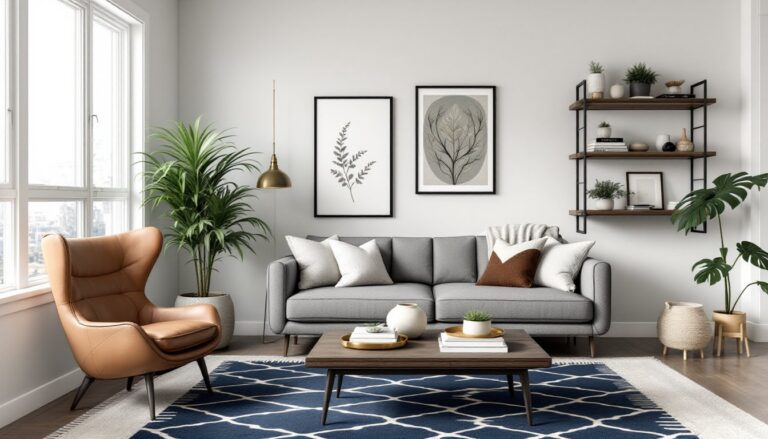
Repetition is the simplest and most powerful form of rhythm. You repeat a design element, a color, pattern, shape, or texture, at regular intervals throughout the room. This repetition trains the eye to expect and find that element again, creating a satisfying sense of unity.
Common examples include repeating throw pillows in the same fabric on a sofa and chair, matching nightstands on both sides of a bed, or coordinating artwork spaced evenly along a hallway. Even architectural features like dining room interior design often uses repeated elements: matching dining chairs, symmetrical wall sconces above a sideboard, or consistently spaced shelving.
Repetition doesn’t mean everything is identical. You might repeat a color in varying saturations, navy, slate blue, and sky blue scattered throughout, or repeat a shape in different scales. A room with 3 to 5 repeated elements feels cohesive without being monotonous.
Progression: Creating Movement And Visual Interest
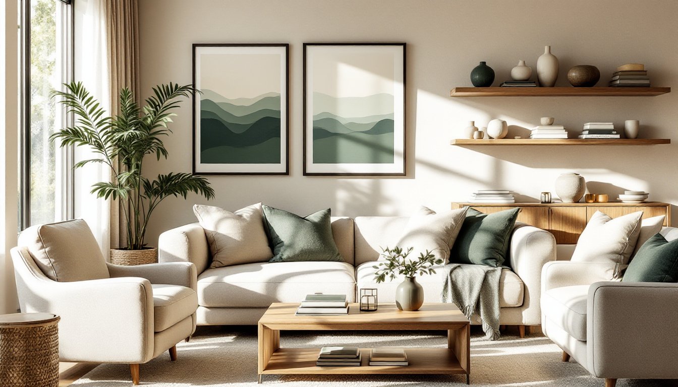
Progression introduces subtle, gradual changes to an element as it repeats. Rather than an element staying the same or changing randomly, it shifts incrementally in size, color, value, or intensity, creating a sense of direction and movement.
Imagine a wall of floating shelves displaying books arranged by spine color, transitioning gradually from red to orange to yellow to green. Your eye naturally follows the color shift, creating visual momentum. Or consider a modern art wall where framed prints gradually increase in size from top to bottom, drawing the eye downward. Progression can also work with texture: a living room wall combining smooth paint, then a textured accent stripe, then shiplap, progressing in tactile interest.
Progression is subtler than repetition and requires more planning, but it elevates a room from “coordinated” to “designed.” It’s especially effective for drawing attention to a focal point or organizing chaos into a narrative.
Alternation: Introducing Variation While Maintaining Balance
Alternation is the rhythm of switching between two or more elements in a deliberate pattern. Classic examples include alternating wall colors (stripes), alternating furniture styles (modern sofa paired with vintage chairs), or alternating pattern and solid in a decorative scheme.
Alternation works beautifully in spaces like modern art deco interior design, where geometric patterns might alternate with bold solid colors, or sleek metal fixtures alternate with plush velvet upholstery. It prevents a space from feeling too predictable (pure repetition) or too chaotic (no pattern at all). The key is that the alternation itself is predictable, the viewer understands the pattern and anticipates what comes next.
How To Apply Rhythm In Your Home Design Projects
Applying rhythm practically means making intentional choices about how you arrange and coordinate your decor. Start by identifying a dominant element you want to repeat, this might be a paint color, a material (like wood or metal), a pattern (stripes, geometric), or a shape (circles, rectangles).
For a bedroom refresh, choose a color palette (say, sage green and cream), then repeat those colors through the bedding, curtains, accent wall, nightstand decor, and wall art. This repetition creates immediate cohesion. Add progression by varying the tints and shades: pale sage on walls, medium sage in a geometric throw pillow, deep sage in a headboard accent. Finally, introduce a contrasting alternating element, metallic gold hardware alternating with matte black drawer pulls, to prevent everything from feeling too matchy.
In a living room home interior design project, apply rhythm through furniture arrangement. Rather than pushing all pieces against walls, create clusters that repeat. A sofa paired with two matching end tables, mirrored by a second seating area with identical proportions and styling, creates visual balance. Add a repeated accent color (maybe throw pillows or artwork) that appears in each seating zone.
Don’t overlook smaller elements. Rhythmic spacing of shelving, books arranged by color, or regularly spaced decorative objects on a mantel all contribute. Even floor coverings play a role: a patterned rug repeated in scale and color scheme across different rooms creates interior design ideas for home that feel intentionally connected.
Start with one room, one wall, or even one piece of furniture and master the concept before expanding to your whole home. As your rhythm choices become second nature, you’ll begin recognizing and fixing rhythm problems instinctively, that empty corner that needs a repeated element, or that corner that feels too busy and needs simplification.
Common Mistakes To Avoid When Using Rhythm In Design
The most common rhythm mistake is having no rhythm at all, treating design as purely functional without considering how elements relate to each other. A room with three throw pillows in three different colors, artwork that doesn’t coordinate with anything, and random decorative objects feels restless and unfinished, even if every piece is quality.
Another trap is over-repetition. Repeating an element 10 times doesn’t create stronger rhythm: it creates tedium. Most designers follow the rule of three: repeat an element three to five times in strategic locations, then vary. A room with matchy-matchy everything, all furniture the same wood tone, all accessories the same color, all shapes the same geometry, feels stiff and uninviting, like a showroom.
Failing to consider scale is another pitfall. Repeating a small pattern on both wallpaper and throw pillows can work, but if your wallpaper pattern is tiny and your pillow pattern is huge, they don’t create visual cohesion: they feel disconnected. Scale consistency strengthens rhythm.
Ignoring function for the sake of design is a setup for failure. Adding rhythm shouldn’t compromise comfort or usability. If a decorative arrangement blocks foot traffic or creates an awkward furniture layout, your rhythm choices are working against you, not for you.
Finally, don’t assume that interior design for home needs to follow trends. Rhythm is timeless because it’s about visual harmony, not trend-chasing. Applying rhythm using classic colors, shapes, and patterns creates longevity. Trendy rhythm choices age quickly and feel dated faster than timeless ones. Focus on foundational rhythm principles rather than chasing what’s popular this season.