If you’re planning to self-publish a book, you’ve probably realized that writing the manuscript is only half the battle. The other half? Getting the interior layout right. Book interior layout design services handle the technical and visual side of publishing, everything from how text sits on the page to how chapters break across spreads. Whether you’re putting together a novel, memoir, photography collection, or how-to guide, professional book design transforms your manuscript into a polished, readable product. This guide walks you through what these services actually do, why they matter, and how to decide if you should hire a professional or tackle it yourself.
Table of Contents
ToggleKey Takeaways
- Book interior layout design services transform manuscripts into polished, readable products by managing typography, margins, spacing, and image placement—elements that directly influence how readers perceive your book’s quality.
- Professional designers ensure your book meets industry standards for print-on-demand and digital distribution, preventing formatting issues and technical problems that could hurt sales.
- Typography choices matter significantly: serif fonts improve readability in print, sans-serif fonts work better digitally, and maintaining a clear heading hierarchy prevents reader eye fatigue and improves navigation.
- Standard margins (0.75-inch outer, 1-inch gutter) and proper line spacing (1.15 to 1.5) are not arbitrary—they ensure text remains readable and accessible in both physical and digital formats.
- DIY book interior design is possible with software like Adobe InDesign or Affinity Publisher, but requires design knowledge; hiring a professional is especially worthwhile for illustrated books, complex layouts, or if sales are a priority.
- A poorly designed interior makes readers assume low writing quality, even if your manuscript is excellent—professional book interior layout design services protect your credibility and encourage people to keep your book on their shelves.
What Are Book Interior Layout Design Services?
Book interior layout design services handle the behind-the-scenes work that makes a book look professional and read smoothly. These services go beyond throwing text on a page, they involve strategic decisions about how your content flows, breathes, and guides the reader’s eye.
A professional book designer controls typography choices, sets proper margins and gutters (the space along the spine), determines page size, handles image placement, and creates consistent styles for headings, body text, and special elements like callout boxes or footnotes. They ensure your book meets industry standards so it can be printed professionally or distributed digitally without formatting hiccups.
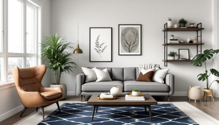
Think of it like framing a picture. The content is your artwork, but the frame, the layout, makes it shine. A poorly designed interior looks amateurish, discourages reading, and can actually hurt sales. Readers may not consciously notice good design, but they definitely notice when something feels off.
Why Professional Book Design Matters for Self-Publishers
Self-published books compete on shelves and in online stores against traditionally published titles. Readers have high expectations. If your book’s interior looks sloppy, with inconsistent margins, poor font choices, or awkward line breaks, people assume the writing matches that quality. That’s unfair, but it’s real.
Professional layout design solves several practical problems. It ensures readability across different formats (hardcover, paperback, ebook). It handles technical specs for print-on-demand platforms like Amazon’s Kindle Direct Publishing or IngramSpark. A designer also knows how to manage widows and orphans (single words or lines stranded at page breaks), prevent awkward page breaks mid-paragraph, and optimize line length for comfortable reading.
For homeowners documenting renovation projects or writing personal histories, a polished interior layout gives your book credibility and makes it feel like a real publication. It’s the difference between something that looks like a school project and something people want to keep on their shelves. Proper book interior layout design services also ensure your images sit properly, captions are sized correctly, and visual hierarchy guides readers through your content.
Key Elements of Effective Book Interior Design
Typography and Font Selection
Font choice isn’t just aesthetic, it affects how easily readers can consume your book. Body text typically uses serif fonts (like Garamond, Baskerville, or Minion Pro for print) because serifs aid readability in physical books. Sans-serif fonts (like Helvetica or Futura) often work better for digital and screen-based reading.
Your heading hierarchy needs clear distinction. If your body text is 11-point Garamond, chapter titles might be 24-point bold, and section subheadings might be 14-point. This visual separation helps readers navigate and prevents eye fatigue. Avoid more than two or three font families in a single book, it looks chaotic.
Font pairing matters, too. Professional designers understand which fonts work together harmoniously. A serif body font paired with a complementary sans-serif for headings is standard practice. Inconsistent font sizing or randomly switching typefaces reads as amateurish and distracts from your message.
Spacing, Margins, and Page Layout
Margins aren’t arbitrary. Industry standards exist for a reason. A typical paperback has 0.75-inch outer margins (top, bottom, right) and a 1-inch gutter (left margin, toward the spine). These aren’t just decoration, they keep text away from edges where it might get cut during printing or become hard to read in the binding.
Line spacing (leading) and paragraph spacing affect how inviting your page looks. Too tight, and readers feel cramped. Too loose, and pages feel sparse. Typically, body text uses 1.15 to 1.5 line spacing. Space between paragraphs is usually 0.5 to 1 line height, enough to signal a break without excessive white space.
Page size also matters. Standard book sizes in the US are 5.5″ × 8.5″ (paperback), 6″ × 9″ (trade paperback), or 8.5″ × 11″ (larger format). Your text layout must match your intended trim size to ensure proper readability. A novel in a 4×6 size with 11-point font becomes eye-torture. A how-to guide with lots of images might need a larger trim size to accommodate visuals properly.
Choosing the Right Book Interior Design Service for Your Project
Not all book design services are equal. Some specialize in fiction, others in photography books or technical manuals. When evaluating options, look at their portfolio and see if they’ve designed books similar to yours.
Ask what’s included: Does the service handle initial concept meetings? Do they provide multiple rounds of revisions? Can they deliver files in multiple formats (PDF, EPUB for ebooks, print-ready files)? Do they handle corrections after initial delivery? Some designers charge flat fees: others work hourly. Flat fees ($500–$3,000+ depending on complexity) offer predictability. Hourly rates ($50–$150+ per hour) can spiral if revisions multiply.
Communication is critical. Your designer needs to understand your target audience, genre expectations, and vision. Are you publishing a cookbook that needs recipe formatting and food photography layout? A memoir with personal photos? A technical guide with diagrams? A children’s book with illustrations? Each demands different expertise.
Resource sites like Design Milk and Homedit showcase professional design work and help you understand what quality looks like. Check references and ask designers how they’d handle your specific needs. Many will offer a consultation call before committing.
Budget matters, but don’t pick the cheapest option. A $200 design that looks amateurish costs more in lost sales than a $1,500 design that readers respect.
DIY vs. Professional Design: What You Need to Know
Some people succeed designing their own book interiors. It’s possible, but it requires specific skills and tools.
If you go DIY, you’ll need design software. Microsoft Word or Google Docs can work for simple text-only books, but they lack precision for professional layout. Adobe InDesign is the industry standard, it handles typography, master pages, and export to print-ready specs, but it costs $24/month and has a learning curve. Alternatives like Affinity Publisher ($69 one-time) or free options like Scribus exist, though they’re less intuitive.
You also need to understand design principles: typography basics, color theory for covers (if using images), spacing standards, and print specifications. This isn’t intuitive for most people. A common DIY mistake is treating every paragraph like a unit, creating inconsistent spacing and visual chaos. Another is using default fonts and line spacing, which reads amateurish to anyone familiar with books.
When DIY makes sense: simple, text-heavy fiction with minimal formatting: very tight budgets: small print runs where perfection is less critical: or if you have design training already.
When to hire a professional: illustrated books, photography collections (which need careful image placement), books with complex formatting (recipes, scripts, technical manuals), or if you’re serious about sales. Freshome and similar design-focused sites show the level of detail professionals bring, that’s worth investing in for a book you’re selling.
Many self-publishers also work with a professional designer but handle their own cover design or copyediting to manage costs. That’s a practical middle ground.