Opposition rhythm is the design principle that uses contrast and repetition to guide the eye around a room and create visual interest. Rather than letting a space feel flat or monotonous, opposition rhythm introduces deliberate “opposites”, bold colors next to soft ones, rough textures beside smooth surfaces, geometric shapes paired with organic curves, that work together to establish movement and flow. For homeowners and DIYers looking to refresh a room without a full renovation, mastering opposition rhythm offers a practical, cost-effective way to transform ordinary spaces into visually dynamic environments. Understanding this concept helps you make smarter decor choices, from paint colors to furniture placement, that actually enhance how a room feels and functions.
Table of Contents
ToggleKey Takeaways
- Opposition rhythm uses strategic contrast and repetition to guide the eye and create visual interest, transforming ordinary spaces into dynamic environments without expensive renovations.
- Color contrast through complementary color pairs—navy and gold, emerald and cream, charcoal and blush—combined with temperature shifts between warm and cool tones forms the most powerful tool for opposition rhythm.
- Shape, texture, and proportion contrasts (geometric versus organic forms, rough versus smooth surfaces, large versus petite pieces) create movement and prevent rooms from feeling flat or monotonous.
- Balance opposition rhythm at roughly 70% dominant elements, 20% secondary contrasts, and 10% accent pops to achieve visual interest without overwhelming the space.
- Opposition rhythm adapts across all room types and design styles—from living rooms and kitchens to bedrooms and hallways—making it an accessible, budget-friendly principle for homeowners and DIY enthusiasts.
- Start small with one or two strategic contrasts, such as swapping throw pillows, adding an accent wall, or changing hardware, to test and layer contrast before committing to larger changes.
What Is Opposition Rhythm and Why It Matters
Opposition rhythm isn’t a trendy design buzzword, it’s a foundational principle rooted in how our brains process visual information. Think of it as the opposite of monotony: instead of repeating the same color, texture, or shape endlessly, you strategically introduce contrasts that keep the eye engaged and moving through the space.
When opposition rhythm works well, a room feels intentional and alive. A stark white wall with a deep navy accent becomes more interesting than two identical white walls. A glossy marble countertop next to matte cabinetry creates visual depth that flat, uniform surfaces cannot. Without opposition rhythm, even an expensive, well-furnished room can feel bland or disconnected.
The principle matters because it directly impacts how you experience a space. Movement and contrast naturally draw attention, establish focal points, and help you organize visual “weight” around a room. A living room with balanced opposition rhythm invites you to look longer and feel more engaged: one without it feels forgettable. For DIYers on a budget, opposition rhythm gives you maximum impact without maximum expense, you’re not replacing everything, just introducing strategic contrasts that make what you have look sharper and more cohesive.
This principle also works across different design styles. Whether your home leans toward modern Art Deco interior design or masculine interior design, opposition rhythm adapts to your aesthetic. It’s the backbone of visual storytelling in any room.
The Principles of Creating Opposition Rhythm
Building opposition rhythm starts with understanding its core mechanics: contrast, repetition, and balance. You’re not just randomly throwing opposites together: you’re orchestrating them deliberately to guide the viewer’s eye and create a sense of intentional movement.
Using Color Contrast and Complementary Palettes
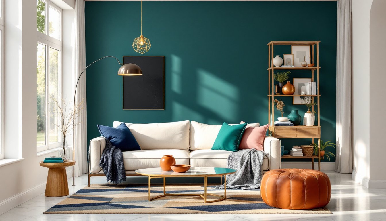
Color contrast is the most powerful tool for opposition rhythm. Complementary color pairs, colors opposite each other on the color wheel, naturally create visual tension and interest. Think navy and gold, deep emerald and warm cream, charcoal gray and soft blush. These combinations feel sophisticated and dynamic without feeling chaotic.
The key is proportion and placement. A single complementary color doesn’t create rhythm: strategic repetition does. If you’re painting an accent wall in deep teal, echo that color in throw pillows, artwork, or even a bookshelf back. Introduce the complementary warm tone (perhaps in brass hardware, wood trim, or upholstered seating) in multiple locations around the room. This repetition, anchored by contrasting colors, creates a visual path that the eye naturally follows.
Warm and cool tones also play a role. A room full of warm tones (reds, oranges, golds) feels cozy but can become oppressive. Introduce cool tones (blues, grays, silvers) in smaller amounts, a cool-toned rug, a gray upholstered chair, pale blue artwork, and suddenly the space breathes. According to House Beautiful’s design guides, this temperature contrast is often what separates an inviting room from one that feels overdone.
Start small: if repainting isn’t in the budget, swap in throw pillows, curtains, or artwork in complementary colors. This approach costs less than new paint and lets you test whether the rhythm feels right before committing.
Balancing Shapes, Textures, and Proportions
Opposition rhythm extends beyond color. Shape contrast, pairing geometric furniture with organic curves, hard-edged shelving with rounded mirrors, angular pendant lights with flowing drapery, creates rhythm through form. A room full of rectangular shapes (boxy sofa, straight-lined cabinets, linear coffee table) feels sterile until you introduce a curved accent chair, a round side table, or an arched doorway. That contrast anchors visual interest.
Texture contrast is equally important and often overlooked. Rough wooden beams against smooth plaster walls, matte finishes paired with glossy surfaces, soft fabrics beside metallic accents, these tactile oppositions engage the eye (and, if touched, the hand) in ways flat, uniform surfaces cannot. A velvet throw on a linen sofa, a distressed metal shelf against sleek cabinetry, or smooth stone countertops with textured tile backsplash all create opposition through materials.
Proportion and scale also play a role. Large-scale furniture next to petite accent pieces, bold patterns balanced by solid neutrals, a statement pendant light centered above a modest side table, these size contrasts prevent the eye from landing anywhere too long, instead guiding it through the space in a thoughtful progression.
The balance matters: if every square inch of a room screams contrast, it becomes exhausting. The rule of thumb is roughly 70% dominant elements, 20% secondary contrasts, and 10% accent pops. This hierarchy ensures opposition rhythm creates movement without chaos. Interior design ideas for home that successfully integrate this balance tend to feel both dynamic and restful, visually interesting but not overwhelming.
Practical Applications for Every Room
Opposition rhythm looks different in a kitchen than in a bedroom, but the principle remains consistent: introduce strategic contrasts that guide the eye and create visual interest without overwhelming the space.
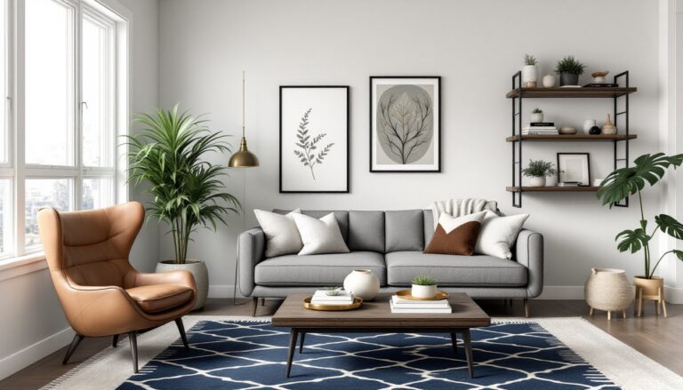
Living Room: Anchor the space with a neutral sofa (cream, gray, or soft tan). Layer in a bold accent wall, dramatic artwork, or patterned area rug in a complementary color, deep jewel tones work well here. Balance that visual weight with metallic accents (brass or copper hardware, a gold-framed mirror) and varied textures (leather seating, a wool throw, a smooth ceramic side table). The eye travels from bold to subtle and back again, creating rhythm.
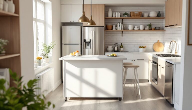
Kitchen: If your cabinetry is light and minimal, introduce darker countertops or a bold tile backsplash. Pair sleek stainless-steel appliances with warm wood open shelving. Hang pendant lights with geometric frames above a soft-edged island. Mix material finishes, smooth quartz beside textured subway tile, matte black hardware on light maple doors. This contrast keeps a kitchen from feeling too clinical while remaining functional.
Bedroom: Opposition rhythm here prioritizes balance between visual interest and calm. Choose a neutral wall color, then introduce a dramatic headboard (upholstered, wooden, or patterned wallpaper). Layer bedding in complementary tones, a soft neutral base with one jewel-toned pillow accent, a textured throw blanket. Position a sleek metal nightstand alongside a natural wood dresser. The result feels curated, not restless. Resources like Freshome regularly showcase bedrooms where opposition rhythm enhances relaxation rather than disrupting it.
Bathroom: Small bathrooms benefit enormously from opposition rhythm because it creates the illusion of spaciousness. Pair dark tile (an accent wall, a border strip) with pale walls. Mix finish types, matte black fixtures against polished chrome or brushed gold. Add textured towels, smooth ceramic soap dispensers, and natural wood shelving beside cool-toned glass or stone. The eye bounces around the room, making it feel larger.
Hallways and Entryways: These often-forgotten spaces are perfect for opposition rhythm practice. Paint three walls a soft neutral and one wall a rich, saturated color. Hang a statement mirror (frame style contrasts with wall color), add a sculptural side table, and layer in varied textures with a runner rug and wall-mounted art. The contrast turns a bland passageway into an intentional introduction to your home’s style.
When implementing opposition rhythm, start with one or two contrasts per room rather than overhauling everything. A single accent wall and new throw pillows can transform a bedroom. Swapping cabinet hardware and adding a patterned backsplash might be all a kitchen needs. Small, strategic changes compound, and you’ll quickly develop an eye for where contrast strengthens a space and where it feels forced. Modern home interior design trends increasingly favor this layered, thoughtful approach over the “matchy-matchy” aesthetic that dominated earlier decades.
Conclusion
Opposition rhythm transforms rooms by introducing intentional contrast and movement, not through expensive overhauls, but through strategic color, texture, shape, and proportion choices. Whether you’re refreshing a living room, kitchen, or bedroom, the principle remains the same: guide the eye through thoughtful opposites that feel balanced rather than chaotic. Start small, layer in contrasts thoughtfully, and watch your space evolve from flat to dynamic. This foundational design principle works across every style and budget level, making it an accessible tool for any homeowner or DIY enthusiast looking to bring their rooms to life.